this post was submitted on 01 Feb 2025
39 points (89.8% liked)
Aotearoa / New Zealand
1691 readers
2 users here now
Kia ora and welcome to !newzealand, a place to share and discuss anything about Aotearoa in general
- For politics , please use [email protected]
- Shitposts, circlejerks, memes, and non-NZ topics belong in [email protected]
- If you need help using Lemmy.nz, go to [email protected]
- NZ regional and special interest communities
Rules:
FAQ ~ NZ Community List ~ Join Matrix chatroom
Banner image by Bernard Spragg
Got an idea for next month's banner?
founded 2 years ago
MODERATORS
you are viewing a single comment's thread
view the rest of the comments
view the rest of the comments

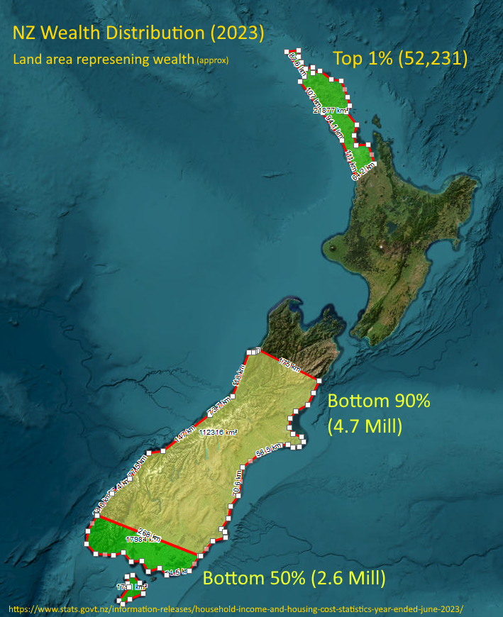
So you're attempting to represent percentages of population and their wealth in terms of the land area covered?
If this is so, i don't understand whats happening at the bottom of North, and Top of South Island.
Are the numbers in the brackets number of people in that section?
Looks like an interesting design, but it needs a little more work to work well as a quick visual understanding of the data being communicated.
That unlabeled middle part must be the top 10% (minus Northland which represents the top 1%).