this post was submitted on 27 Jul 2023
678 points (92.6% liked)
Fuck Cars
11687 readers
683 users here now
A place to discuss problems of car centric infrastructure or how it hurts us all. Let's explore the bad world of Cars!
Rules
1. Be Civil
You may not agree on ideas, but please do not be needlessly rude or insulting to other people in this community.
2. No hate speech
Don't discriminate or disparage people on the basis of sex, gender, race, ethnicity, nationality, religion, or sexuality.
3. Don't harass people
Don't follow people you disagree with into multiple threads or into PMs to insult, disparage, or otherwise attack them. And certainly don't doxx any non-public figures.
4. Stay on topic
This community is about cars, their externalities in society, car-dependency, and solutions to these.
5. No reposts
Do not repost content that has already been posted in this community.
Moderator discretion will be used to judge reports with regard to the above rules.
Posting Guidelines
In the absence of a flair system on lemmy yet, let’s try to make it easier to scan through posts by type in here by using tags:
- [meta] for discussions/suggestions about this community itself
- [article] for news articles
- [blog] for any blog-style content
- [video] for video resources
- [academic] for academic studies and sources
- [discussion] for text post questions, rants, and/or discussions
- [meme] for memes
- [image] for any non-meme images
- [misc] for anything that doesn’t fall cleanly into any of the other categories
Recommended communities:
founded 2 years ago
MODERATORS
you are viewing a single comment's thread
view the rest of the comments
view the rest of the comments
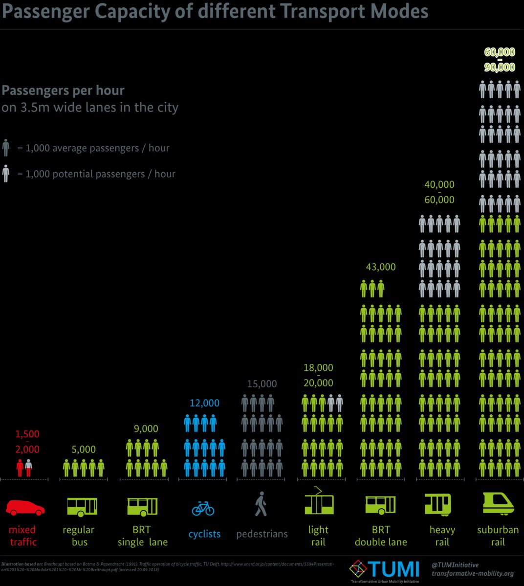
I don't understand this visualisation. Perhaps I'm lacking context. Anybody willing to do ELI5... maybe ELI15? What quantity is being compared and what are potential passengers?
The context is that they're showing one metric among many and are hoping you'll draw the conclusion they want: that cars are an inefficient way to travel. It'd be interesting to see distance and time metrics added. For example, while pedestrian capacity is pretty large, the distance travelled for any specific time period is short, so people aren't walking somewhere 100 miles away.
Similarly, door-to-door travel time can vary a lot. Suburban commuter rail around here is fast, but you need to drive to the station (because suburbs are designed for cars), wait for a train, commute on the train, then find your way to your actual destination from the station you get off the train at, so that might include walking or public transit.
Obviously, any one of the options can make the most sense in a given situation, but the infographic isn't trying to show that.
I agree the graphic alone isn't super clear. I read it as the higher number being the potential capacity (such as in a particularly high-capacity system), and the lower number being the more typical capacity. Consider suburban rail, for instance. Some systems might have double-decker trains and more compact seating that allows for higher capacity, whereas some may have just single-decker trains. The double-decker system will have a higher capacity, whereas the single-decker might be more representative of what the "average" capacity of a suburban rail system might be, while the higher number might be more representative of the "potential" capacity of a suburban rail system when you really push it to its limit.