this post was submitted on 05 Dec 2024
263 points (96.8% liked)
Games
17247 readers
235 users here now
Video game news oriented community. No NanoUFO is not a bot :)
Posts.
- News oriented content (general reviews, previews or retrospectives allowed).
- Broad discussion posts (preferably not only about a specific game).
- No humor/memes etc..
- No affiliate links
- No advertising.
- No clickbait, editorialized, sensational titles. State the game in question in the title. No all caps.
- No self promotion.
- No duplicate posts, newer post will be deleted unless there is more discussion in one of the posts.
- No politics.
Comments.
- No personal attacks.
- Obey instance rules.
- No low effort comments(one or two words, emoji etc..)
- Please use spoiler tags for spoilers.
My goal is just to have a community where people can go and see what new game news is out for the day and comment on it.
Other communities:
founded 2 years ago
MODERATORS
you are viewing a single comment's thread
view the rest of the comments
view the rest of the comments
Stupid article needs a before and after comparison.
Instead it has way too many ads.
This should have been easy enough to illustrate.
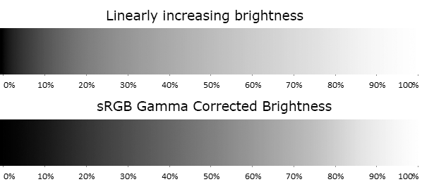
Edit: Here is a greyscale illustration of a similar phenomenon:
From https://www.odelama.com/photo/Developing-a-RAW-Photo-by-hand/
Of course in reality it get a bit more complex when we perceive colors as having different brightness too:
From https://www.vis4.net/blog/avoid-equidistant-hsv-colors/
This is amazing! I wish there was something akin to Lemmy Gold! Lemmy give it to ya!
EDIT I've posted this comment to bestoflemmy
Lemmy Gold you say?
I'm pretty sure you just won comment of the year! This is great and very helpful.
The latter is solved by better colorspaces, like OKLAB.