this post was submitted on 14 Aug 2024
657 points (98.7% liked)
Privacy
34029 readers
837 users here now
A place to discuss privacy and freedom in the digital world.
Privacy has become a very important issue in modern society, with companies and governments constantly abusing their power, more and more people are waking up to the importance of digital privacy.
In this community everyone is welcome to post links and discuss topics related to privacy.
Some Rules
- Posting a link to a website containing tracking isn't great, if contents of the website are behind a paywall maybe copy them into the post
- Don't promote proprietary software
- Try to keep things on topic
- If you have a question, please try searching for previous discussions, maybe it has already been answered
- Reposts are fine, but should have at least a couple of weeks in between so that the post can reach a new audience
- Be nice :)
Related communities
much thanks to @gary_host_laptop for the logo design :)
founded 5 years ago
MODERATORS
you are viewing a single comment's thread
view the rest of the comments
view the rest of the comments

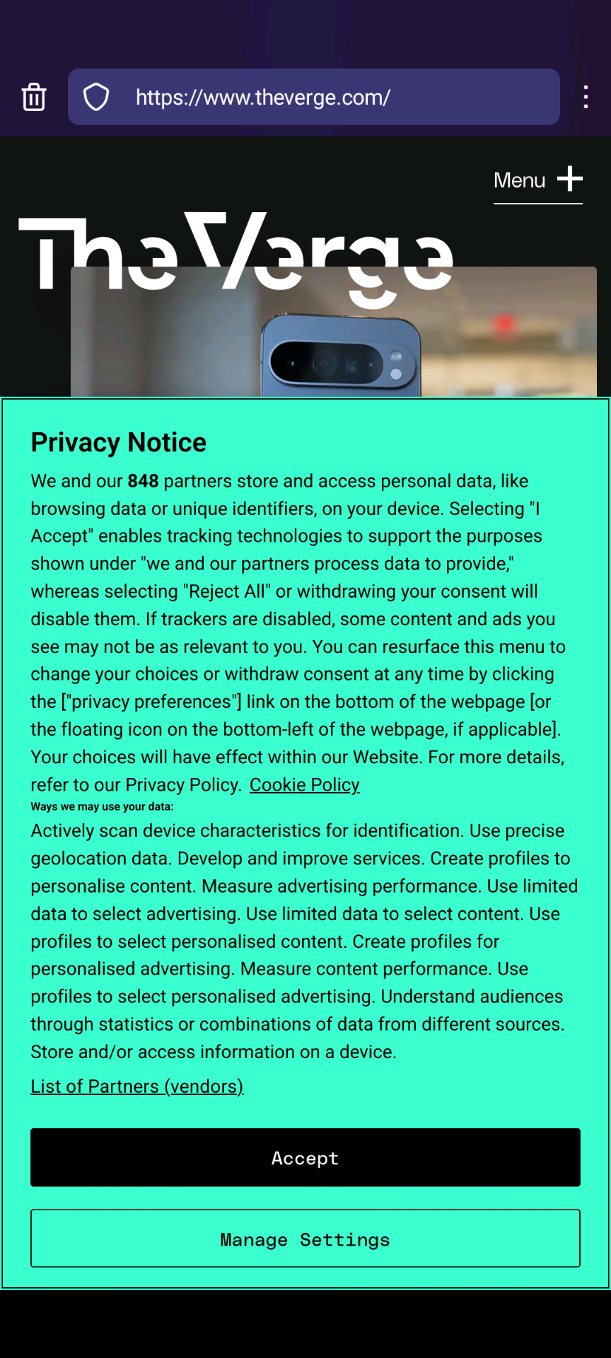
This is for legal reasons mostly. They don't think anyone reads this so they went for the most blunt and transparent language, which also gives them the most legal certainty. The banner is missing the reject all button though, which in Europe is seen as required by many of the privacy regulators.
How is it nonsense?
The EU law is that the reject all should be exactly as easy as the accept all button. 1 extra click, however minor of an inconvenience it is, is extra effort. And therefore strictly speaking in violation of the law.
Nothing will ever happen but it's valid criticism.
You underestimate people’s laziness and their burn out. An extra click to reject all is an extra click people won’t bother with. I literally used to go all the extra steps to reject these things, even when a reject all button was not provided. Plus I’ve found that sometimes the reject all button doesn’t actually reject all, and there are a few hidden settings still left to uncheck. It’s ridiculous. It should be 1 click, just like hitting accept is 1 click. The ease of use should be 1:1. I was getting burned out by those extra clicks and all that manual checking that took like 20s-2mins of my time. That adds up. All to read a single paragraph on some website? Bruh. Used to do this until I discovered ublock origin has settings that can be used to block cookie consent forms.
To you, one extra click is no big deal, like a paper cut of inconvenience. To me, it’s the thousandth papercut I’ve received. I am tired of it.
Big oof here. Maybe make sure you understand what you're talking about before criticizing others?
Why did you edit your comment? At least own it.