this post was submitted on 06 Aug 2024
120 points (95.5% liked)
memes
10689 readers
2023 users here now
Community rules
1. Be civil
No trolling, bigotry or other insulting / annoying behaviour
2. No politics
This is non-politics community. For political memes please go to [email protected]
3. No recent reposts
Check for reposts when posting a meme, you can only repost after 1 month
4. No bots
No bots without the express approval of the mods or the admins
5. No Spam/Ads
No advertisements or spam. This is an instance rule and the only way to live.
Sister communities
- [email protected] : Star Trek memes, chat and shitposts
- [email protected] : Lemmy Shitposts, anything and everything goes.
- [email protected] : Linux themed memes
- [email protected] : for those who love comic stories.
founded 2 years ago
MODERATORS
you are viewing a single comment's thread
view the rest of the comments
view the rest of the comments

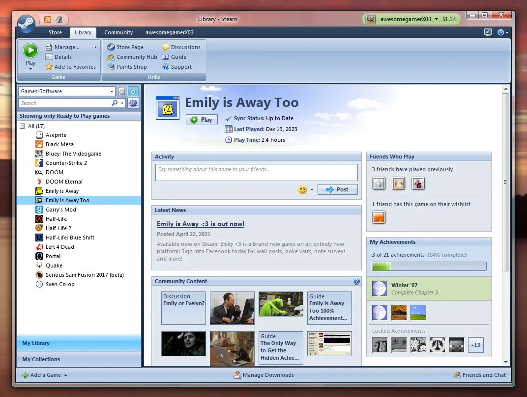
I know a lot of people love this aesthetic but it was my least favorite era for the UI. At least the look of it anyway.
Interesting, this happened to be one of my favorite looks for windows. It came across as comfortable and professional without looking like plastic or feeling sterile. A comfy medium between dark and light mode, and the glass window decorations were a nice little touch. If you don't mind me asking, what was it that you didn't like? Not looking for beef, just perspective.
For whatever reason I just don't like the glass. I can see what people like about it. Mostly for me, I think it does look like plastic and it feels cheap. Which is weird cause I didn't mind Windows Vista when it released.
Office was ugly as all hell during these days, and everyone seemed to want to copy that "shine" the glass had and they sprinkled it on everything.
In the end, I never really grew attached to the design choices I grew up with, its not like XP was pretty either.
Nowadays Linux has made me a snob. If I can't customize everything I get upsetti.
Lmao I'm in the same boat. Accidentally fell down the ricing rabbit hole, lived out of tiling window managers for a bit, and now I'm in gnome since it finally seems to be on par with my rose tinted memories of unity. I appreciate the reply, different strokes for different folks. If you don't mind me asking, what sort of aesthetic do you go for with your Linux config? Is it more of a matte, or something different?
I have a post on unixporn, if you have anything you think is cool and want to share thats a cool place. I'm new to it. I make everything some form of vaporwave/synthwave/outrun color schemes. I do have slight transparency in my terminal background. I'm constantly switching between rounded and sharp borders. I wouldnt say I'm the most picky as I am still forced to use windows at work, but I'm thinking about trying a fresh install again on my desktop and then I'll truly see what I like and what I can do.
Not the person you replied to, but for me it's not a happy medium, it's too far into the plastic-bubble aesthetic. Like a glassy, less colorful version of the baloony XP taskbar style.
Totally understandable, beauty being in the eye of the beholder and all. I appreciate the response, thank you
Yeah I personally actually prefer when programs conform to the OS UI as long as the UI is decent (cough Windows 8), it looks a lot more uniform and cohesive
I agree for "tools". I'm fine with game libraries, media centers/players being a exceptions, IF the UI is done well.
I somewhat like it but could also never use it. My eyes would disown me.