this post was submitted on 18 Jul 2023
647 points (96.0% liked)
Voyager
5512 readers
1 users here now
The official lemmy community for Voyager, an open source, mobile-first client for lemmy.
Rules
- Be nice.
- lemmy.world instance policy
Sponsor development! 👇
💙
founded 1 year ago
MODERATORS
you are viewing a single comment's thread
view the rest of the comments
view the rest of the comments


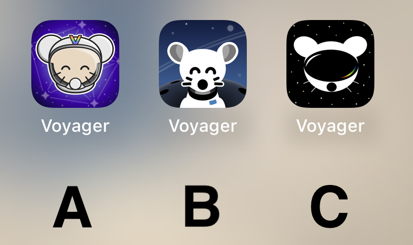
I think B looks the nicest of the three by far. Good use of a monochromatic color scheme, nice balance between background and foreground elements, perfectly readable at a distance.
The design direction of A is a bit busy and stands out a little too much IMO, it looks kind of out of place next to stock iOS apps. C looks a bit too amateur, and has several tangents in it that really bother me - I do like the overall idea of it, but it could really use a rework.
If one is chosen, I’ll give the author the opportunity to tweak :)
Good to know! :)
I started with C, but then clicked the links to compare what hey all looked like on a Home Screen (yes, I eventually followed instructions .. look at me go). B is clearly the standout for me.
Couldn’t agree more. A is lovely, but too cartoony. B is very cohesive and well made. C, as you said, looks amateurish, and the visor looks like a VR headset.