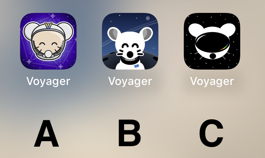
B Please! Looks so very clean.
Voyager
The official lemmy community for Voyager, an open source, mobile-first client for lemmy.
Rules
- Be nice.
- lemmy.world instance policy
Sponsor development! 👇
💙
Definitely B
I’m just here to say: CHARGE YOUR PHONE!
Also, C A B is my ordered preference.
B, good middle ground of clean design yet still has personality
I like A a lot, reminds me of the early iPhone days of tasteful skeumorphism.
B is probably my favorite tho -- definitely the cleanest.
C looks off to me, something about the goggles.
B, but the planet in the background makes it look like extremely large shoulders.
C
Quick comparison on Android (custom launcher): https://i.ibb.co/XVnM2NL/comp.png
C
I liked C best at first glance, but after looking at the screenshots my choice is A.
I like the background of B the best. But it looks more like a dog and it's throwing me off. I like the character of the first one better, especially with the V on the helmet.
So I think I'm voting for A
I will be happy with either b or c
C for sure
Can we have them all and a setting to choose? Other apps do that. Is it a limitation of the PWA?
B looks best for me
A
C
C Simple and cool but gets the point across.
C is very sleek!
Can you add support for themed icons?
https://proandroiddev.com/implement-themed-icons-android-13-d20b89233681
All the other Lemmy apps I tested have themed icons. Be nice to have the same with the only Lemmy app I use 😁
A or C
I'd go with A! I like the presentation of B better but the little guy reminds me of Chuck E. Cheese or fnaf. Character in A is adorable :)
I liked C too but it kinda looks like the Reddit guy in VR goggles.
C
B but with the helmet and head of A would have been amazing. A looks to shiny rn.
I vote B.
I really like B!
I like Option B the most
Definitely A.
B is kinda creepy and C looks like a VR app.
I really like A, feels very professional
Voted for A, it’s definitely the cutest and I like the rainbow “V”. B has a nice background, though. C I think could do with better defining the shape of the head to look more like a helmet and less like a mouse wearing a VR headset :) Great job to all the applicants!
C
I like the current one but I voted for A if you have to change it. It looked the best on the desktop.
I Vote for A. It pops out a bit. But then again it's my most used app. But B Also works. C is a bit unpolished IMHO.
A
I made a shortcut that lets you change web app icons on iOS, so if you either want to try out the icons or actually use a different icon (maybe one of the other great ones that haven’t made it to the final vote). Here it is: Shortcut link
Loving the C image design, it looks great
A
I was hoping for a more rainbow theme! This will be a tough decision.
I want them all! They all look fabulous!
Middle B. SOOOO cute! Good definition and simpler than the others. Good contrast between foreground and background. Great little icon!


