Um, can I get this to work as a default Lemmy typeface? I love it.
I also like Comic Sans in general, what can I say I guess that makes me a giant Eldritch tentacle monster.
All things programming and coding related. Subcommunity of Technology.
This community's icon was made by Aaron Schneider, under the CC-BY-NC-SA 4.0 license.
Um, can I get this to work as a default Lemmy typeface? I love it.
I also like Comic Sans in general, what can I say I guess that makes me a giant Eldritch tentacle monster.
That's actually not bad.
nice, i’ve been using Comic Code for a couple years now which is similar
I'd love to see someone code in the actual Comic Sans rather than the awesomely adapted Comic Mono. Indentation be damned!
I was prepared to hate this, but I actually really like it. Thanks for posting it!
My eyes just can't adjust to this.
I’m intrigued, but it feels so wrong
I am in the same boat. Installing...Dog help me.
not a crime. i use it for my notepad, it looks weird but its fine for me.
Me too man! Been using it for over a year now, coming from Fira Code. It's actually a real enjoyable font to look at.
It's not even monospace
LOL. Love to hear it.
Look what you have done! I used Operator Mono for Italics. I kind of like this!
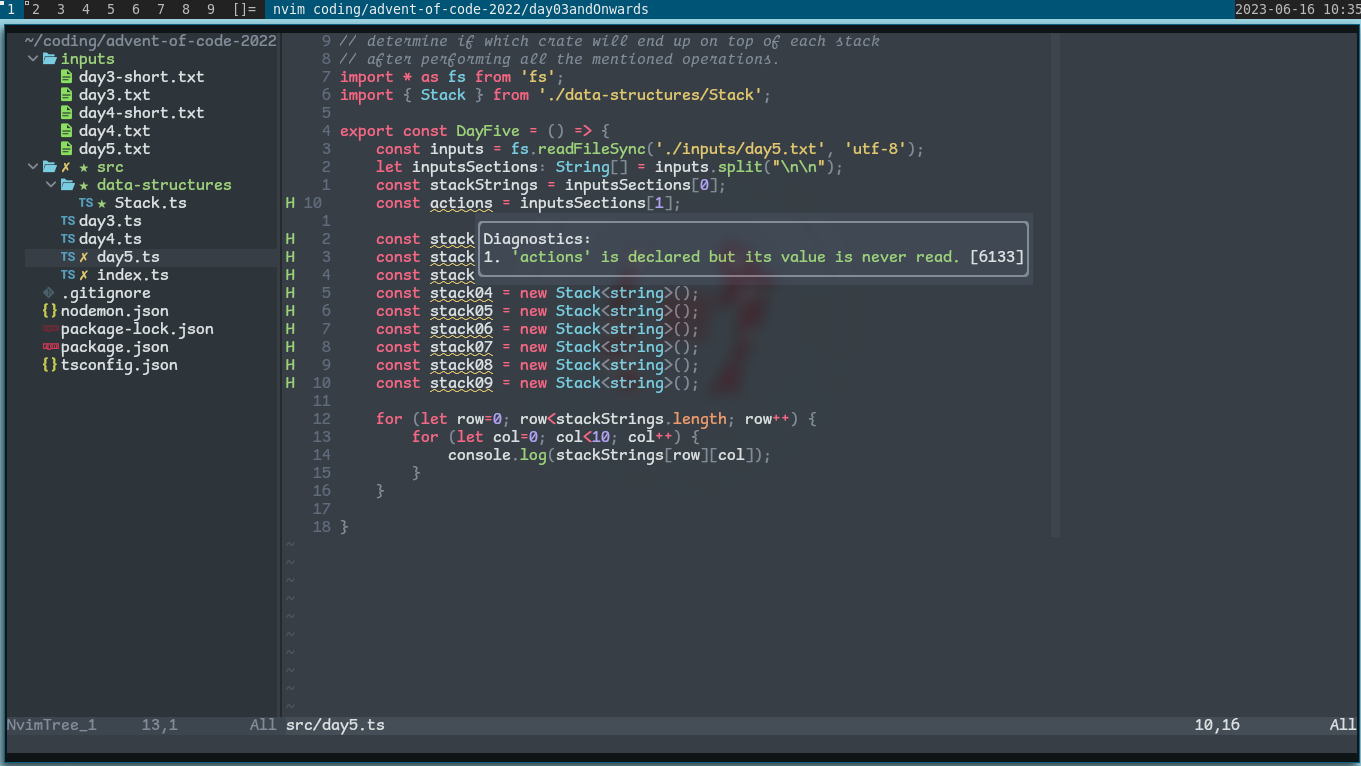
bro... how did you manage to stain a screenshot
Is it that bad? Now I have IBM Plex installed
I was addicted to coding with Comic Mono and ended up purchasing Comic Code. No regrets.
It's actually very common font for dyslexia
At least you’re using a monospaced one…
The actual crime.
Why is it so bad?