Hi, thanks for the feedback! This should now be fixed on beta v183.
this post was submitted on 24 Jul 2024
23 points (96.0% liked)
Connect for Lemmy App
2675 readers
1 users here now
A community for the mobile app Connect for Lemmy.
Links
founded 1 year ago
MODERATORS
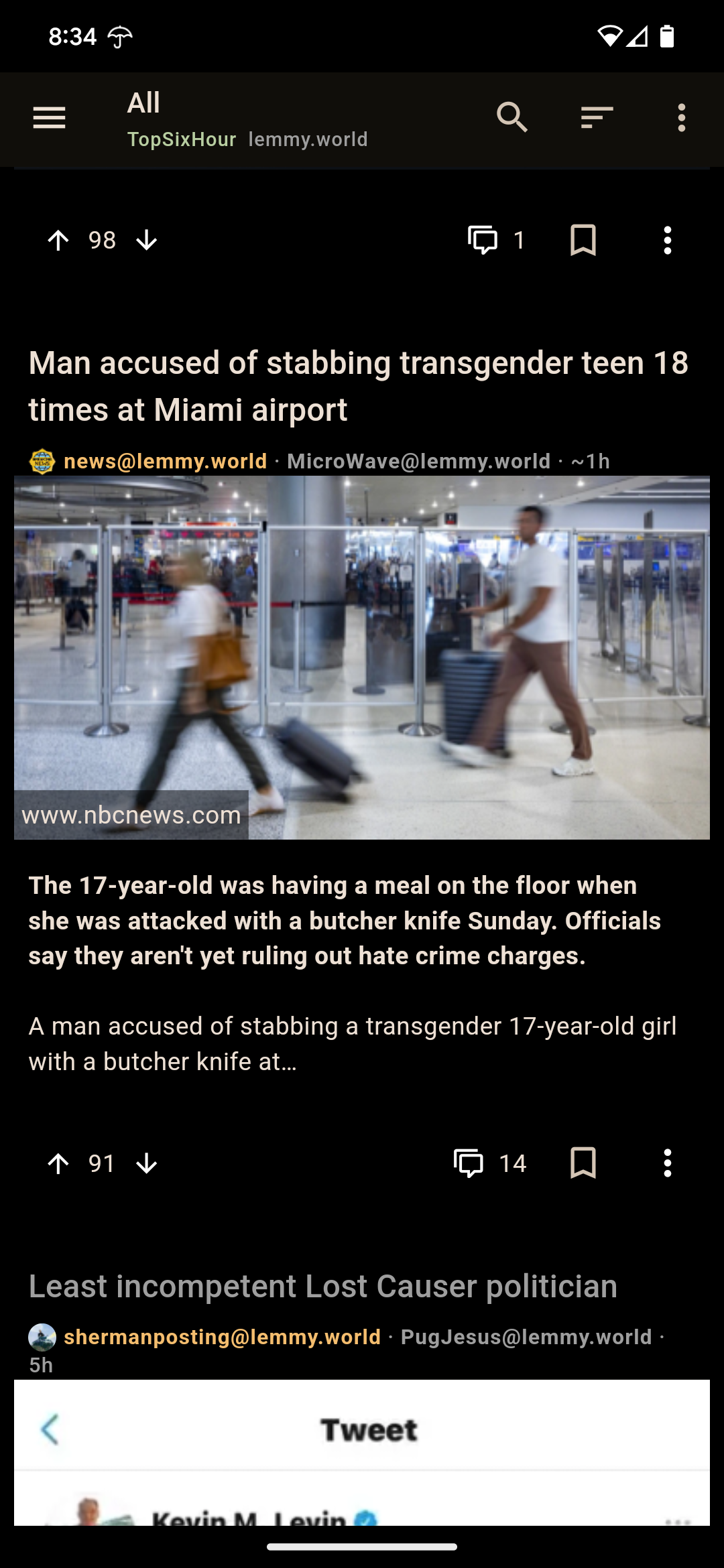
I also miss the defined borders between cards. When I first opened the app this morning I thought I was looking at an extended screenshot and was confused what the gag was until I realized it was just the UI that had gone crappy.
Yeah gimme my cards back! Now it's basically just FULL WIDTH minus a few pixels. And minus any sort of dividing line. It's gotta be a mistake
I use light mode. Everything is now wrapped in white boxes. The boxes around comments aren't even aligned. They follow the indentation that comments do. Maybe they forgot to turn the css for boxes on?
Comments: https://files.catbox.moe/2tqhag.jpg

And posts: https://files.catbox.moe/9lulvk.jpg

