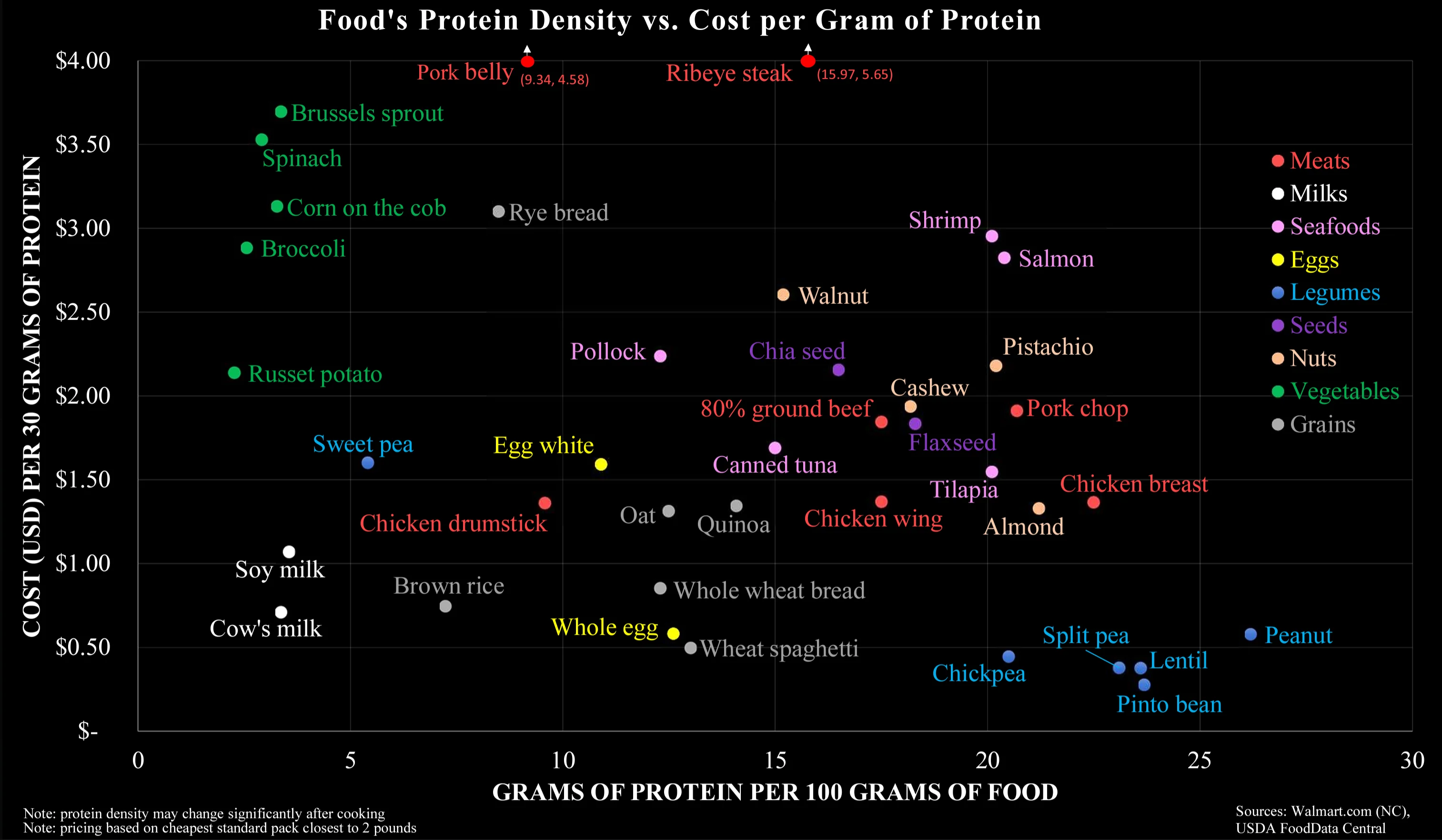
This is the weirdest star map I've ever seen.
Data Is Beautiful
A place to share and discuss data visualizations. #dataviz
Hm... this doesn't exactly make sense - pork is normally cheaper than steak. Or maybe where I live, this is the case?
Also salmon is close to ribeye (protein content) but has far less fat than ribeye. Surprised sirloin steak isn't in there which is normally more expensive than ribeye.
So much wrong about this chart. It is factually correct, but it answers the wrong question.
This chart makes it way too easy to optimise for cheap protein, which is misleading. It is not this what it takes to have a healthy organism. It takes a varied diet, with balanced quantities of liquids (see milk), vitamins (see sprouts), fatty acids (see salmon), minerals (see shrimps, eggs, walnuts), actually carbs (potatoes, rice, spaghetti), and much more...
Lmao you don't need any animals or their secretions in your diet to be healthy.
