this post was submitted on 30 Oct 2023
411 points (96.6% liked)
Data Is Beautiful
7875 readers
1 users here now
A place to share and discuss data visualizations. #dataviz
founded 4 years ago
MODERATORS
you are viewing a single comment's thread
view the rest of the comments
view the rest of the comments

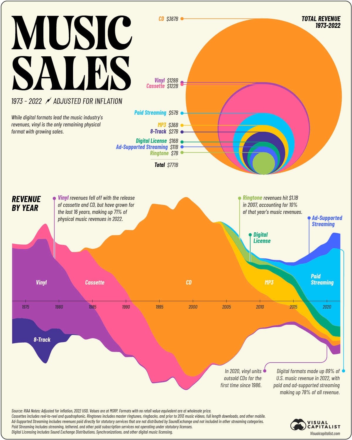
Am I the only one who is totally confused by the lower plot? How is the data distributed among the positive and negative y axis? Is the negative portion supposed to be negative annual revenue? Why are CDs then in the positive and negative at the same time. I desperately need more labeling or explanation please. It sure looks nice, but I'm completely at loss...
There's no positive or negative, just share (width). It is done creatively but still accurately, it looks like the most dominant segment takes the center allowing you to easily spot which was the most popular at what year.