this post was submitted on 23 Jul 2023
742 points (92.7% liked)
Data Is Beautiful
7228 readers
5 users here now
A place to share and discuss data visualizations. #dataviz
founded 4 years ago
MODERATORS
you are viewing a single comment's thread
view the rest of the comments
view the rest of the comments

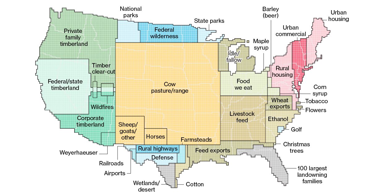
This is a weird ass pie chart using the US map as a base right? If I am correct then this is a terrible way to display this data.
i really do not understand how anyone can be confused by this, obviously it's not a geographical map because new mexico does not contain the sum total of all american railways..
It's a fine graph that gives an intuitive sense for how much area is used for each thing.
It's really funny to imagine it literally, though.
"We'll I'd heard some bad things about West Texas highways, but this just seems excessive."
No no, that's the Grand Texan Runway for landing and takeoff of the death star!