Art Share🎨
This is a friendly community for everyone who wants to share their art with the world! Everyone is welcomed 🎨
Rules
AI Art: While we appreciate AI generated art, there are more appropriate communities to post that type of art to. Please keep posts to non-AI generated art only. This rule includes AI art that was then manually manipulated (e.g. drawing on top of something generated by AI).
Nudity: Nudity is and has always been a part of art, but it may be something that some users don't wish to see or cannot view in certain circumstances (e.g. at work). If your work contains nudity, please mark it as NSFW. Work that contains nudity that is not marked as NSFW will be taken down. As long as the NSFW tag is used, we welcome nude subject matter.
Spam: Please do not spam this community. Self promotion is fine if you just want people to be aware of your work, but blatant attempts at spam will result in the past being removed and possibly a ban. If you aren't sure if what you are posting is spam, please contact the moderator first.
Conduct: Be nice, and don't be a jerk. Constructive criticism is OK, but don't be mean. Encouragement is always welcomed.
view the rest of the comments

Oh this is really fun! I was scrolling through and saw your piece and just had to take a second and pause. It made me =)!
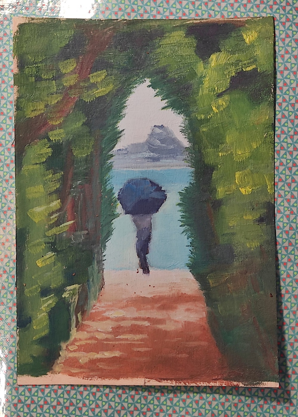
I've got a ping-pong wing-wong kinda brain though and these are the three things that popped up when I saw it: tomie, monet, and a mountain pass
In that order, so take it as you will but I like it. If you want some soft-criticism I would say working on pushing the forms a bit more might be worth having a think about. Because, and this is a personal opinion, I think you can be abstract while still being a little bit neater than what I am seeing in kinda the upper left area abouts. But I understand what all the shapes are, and I think that's really nice!
The only other thing I would say, and I am not sure if it's due to value or composition (because it's very centric in its focus) but as I see it - the figure sits in front of the opening. Although the opening is compositionally clearly in front of the figure. So it creates this real tension with the eyes that causes a lot of bouncing back and forth. But overall it really is a fun painting and I think you did a great job. So take these as you will =)
I just understood your comment about the person sitting in front of the opening. So true, oups!
Maybe the colours needs to be a bit more distant with less red and toned down a bit. Guess I'll have to try it again!
I don't know if I would tone down the red but I don't really paint too much anymore so I can't give you a solid answer. This might sound cheesy but you could look at how others use alcoves in their art (that's from the movie Old) but also maybe how other painters utilize light/dark to transform their ocean scenes. But I don't have actual answers someone else might?
Or you could find them along the way =)! Gl!
Wow that second painting really is something 💖.
Inspiring!
And maybe I can figure out how to move forward better, thanks!
Super cool =)! You're already doing so good. You got this =)!