this post was submitted on 12 Mar 2024
371 points (92.8% liked)
AssholeDesign
7606 readers
2 users here now
This is a community for designs specifically crafted to make the experience worse for the user. This can be due to greed, apathy, laziness or just downright scumbaggery.
founded 1 year ago
MODERATORS
you are viewing a single comment's thread
view the rest of the comments
view the rest of the comments

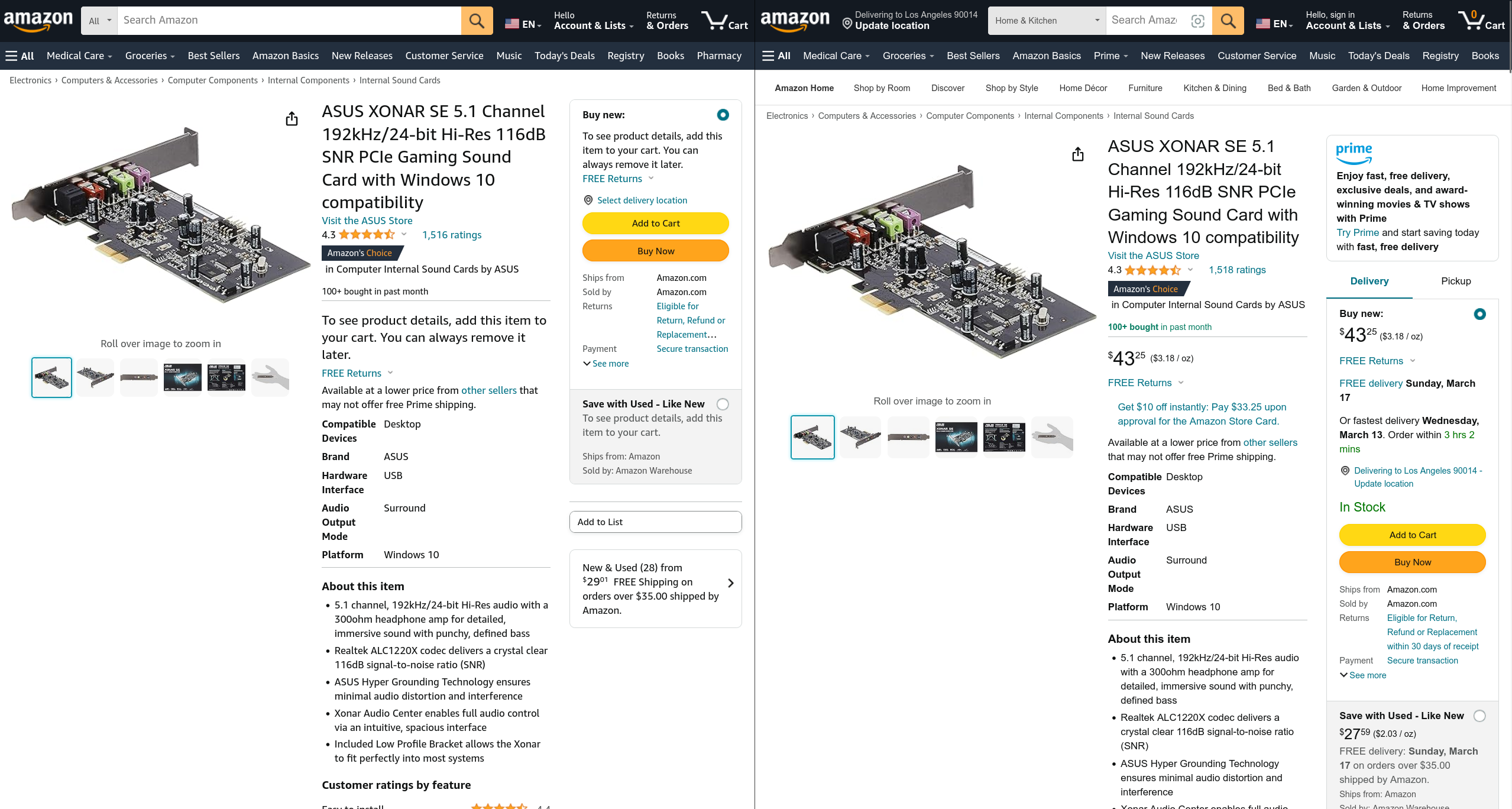
This is actually a common thing and has been around for awhile. I see it on amazon mostly. Seen it on Microcenter's website a number of times as well. Newegg was big on doing it when they were more PC focused and not a chinese website. Was more prominent in the early 2000s as there were more competing online stores back then.